

Prior to the release of the Edgemere Reserve earlier this month, Martenero was a microbrand that had somewhat remained on the horological periphery for me. I was aware of what the four-year-old company was up to as I knew several people that touted them as a leader in the wave of U.S.-based, small-scale brands that crescendoed in the mid-2010s, but despite founder John Tarantino’s location not far from WatchTime HQ in Manhattan, I found myself missing out on Martenero’s releases time and time again.
When the Edgemere Reserve was announced, I knew my repeated oversight had to end. After four years and six different collections of varying styles, the latest Martenero release is the most complex addition to the growing catalog and is also the clearest representation of the brand’s maturing identity. It is able to maintain the playfulness seen in the original Edgemere with a dash of the “grown-up” appeal and symmetrical design seen in the most recent Kerrison series.
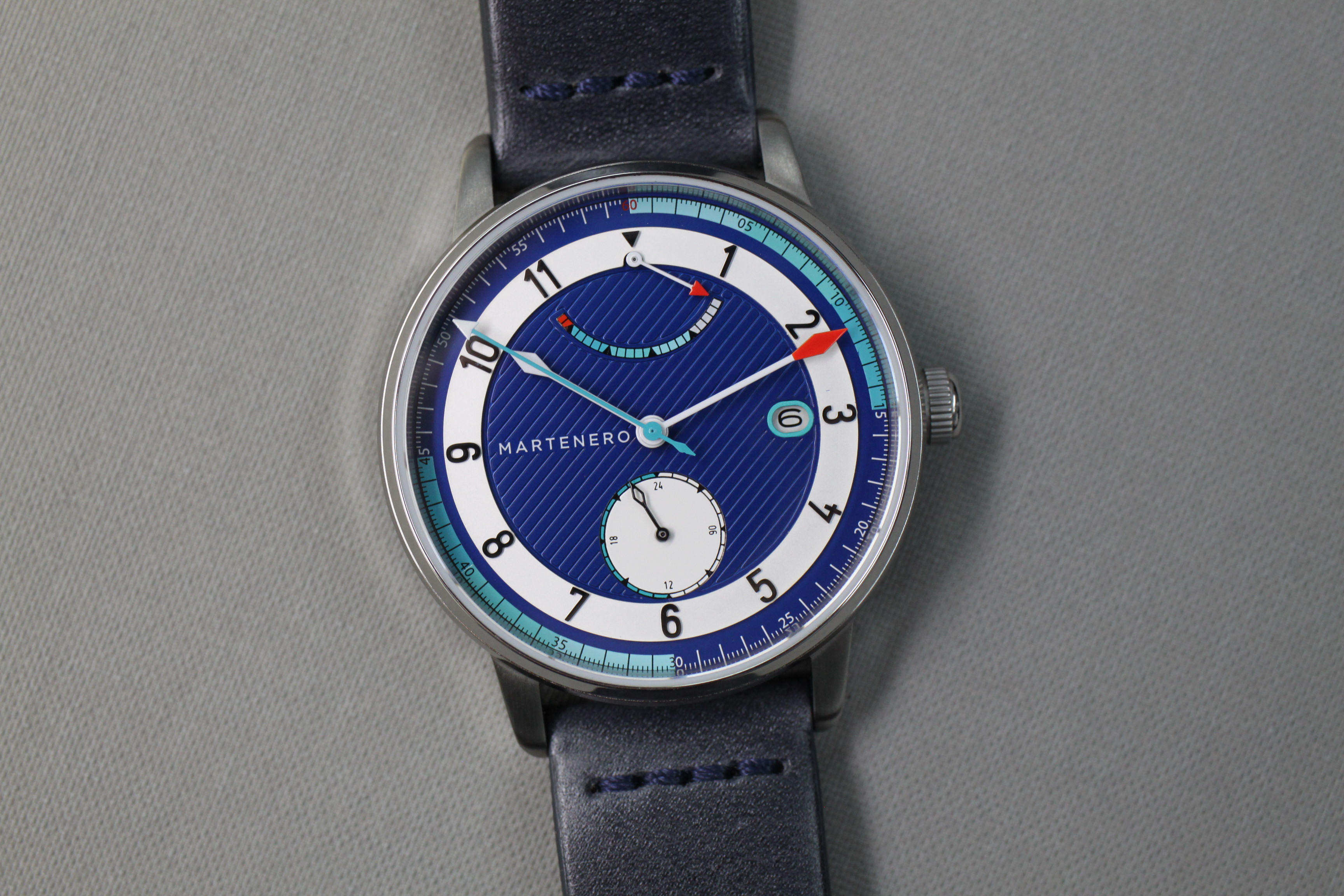
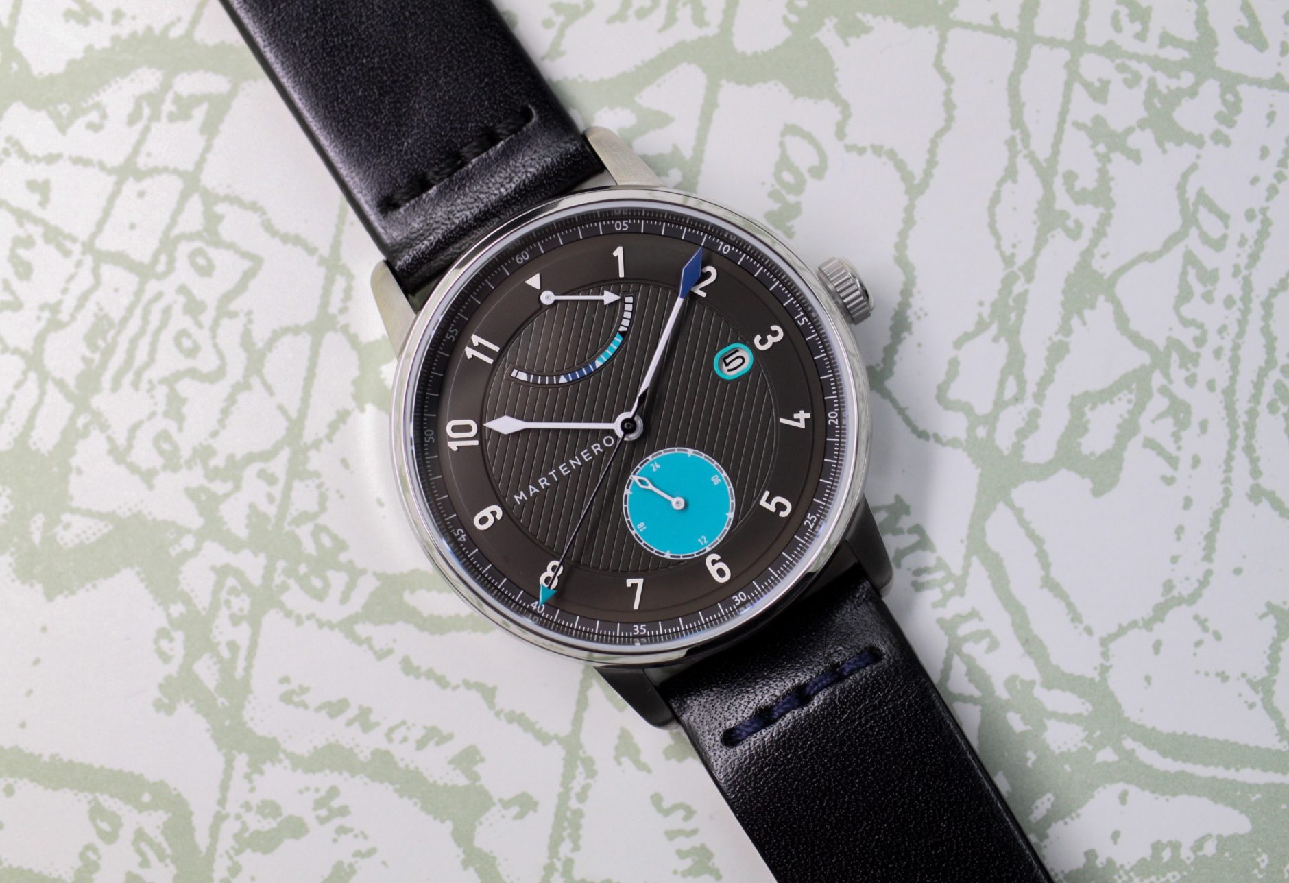
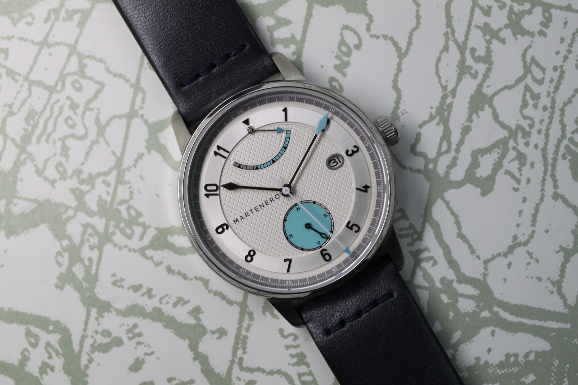
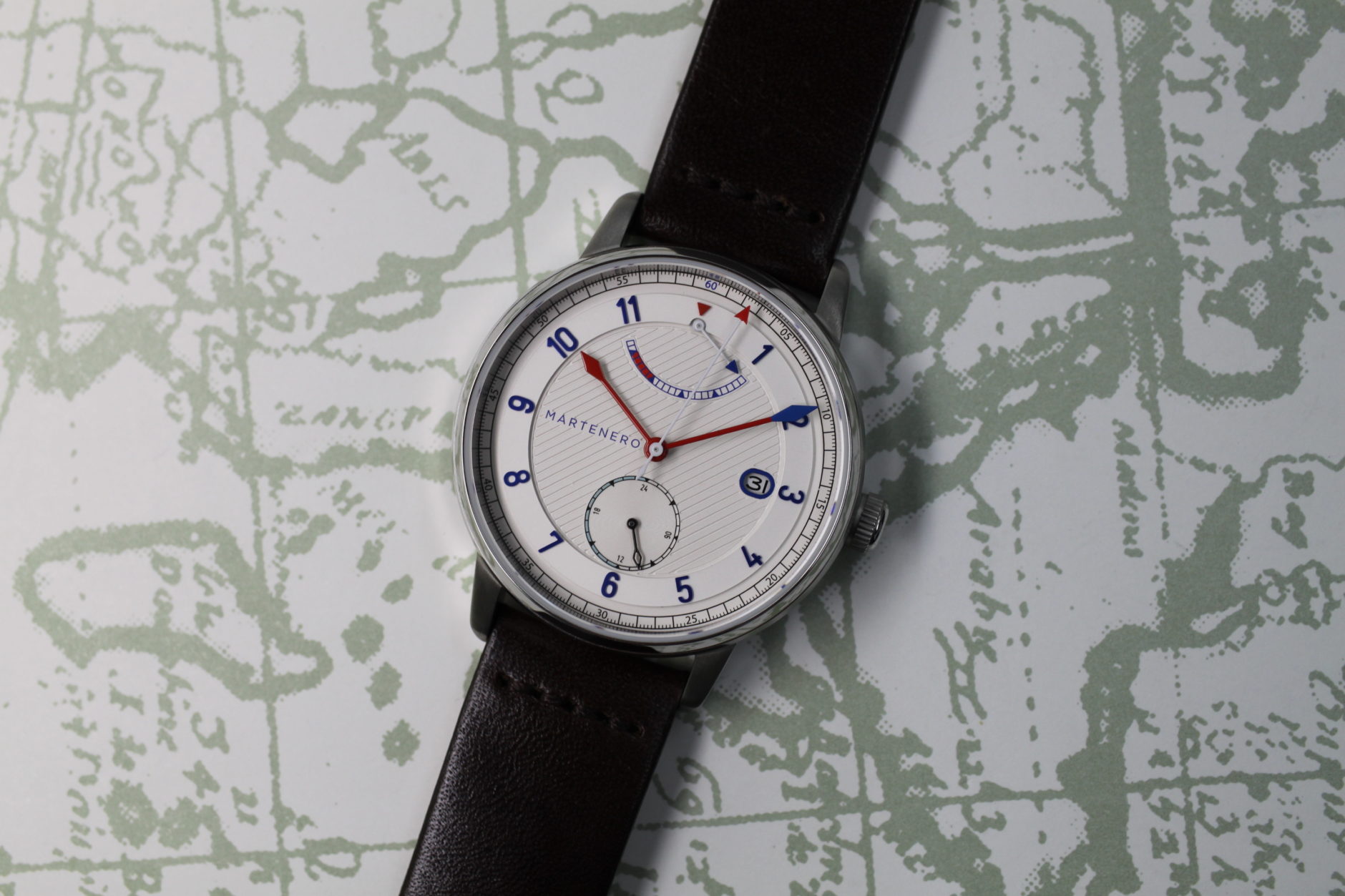
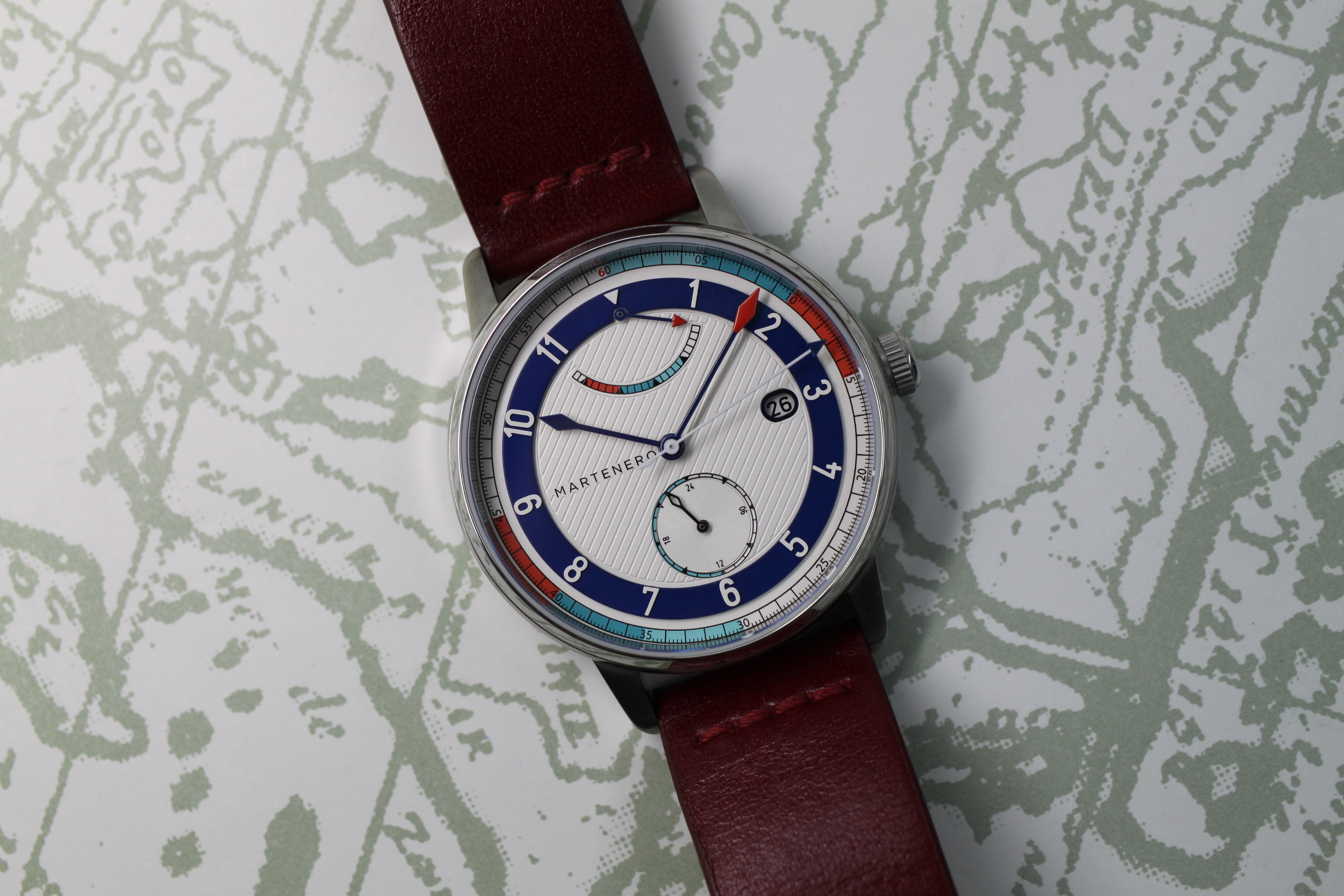
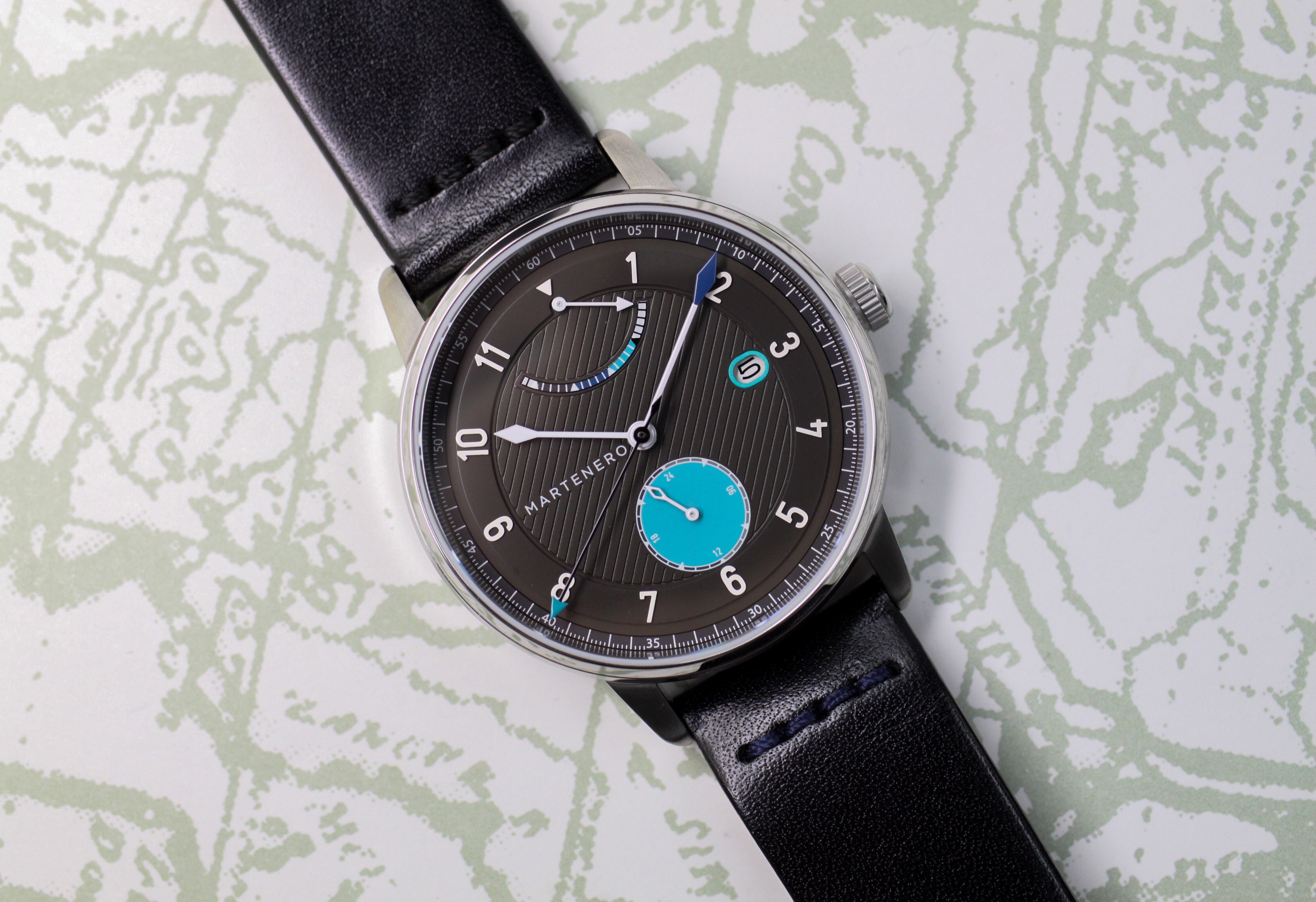
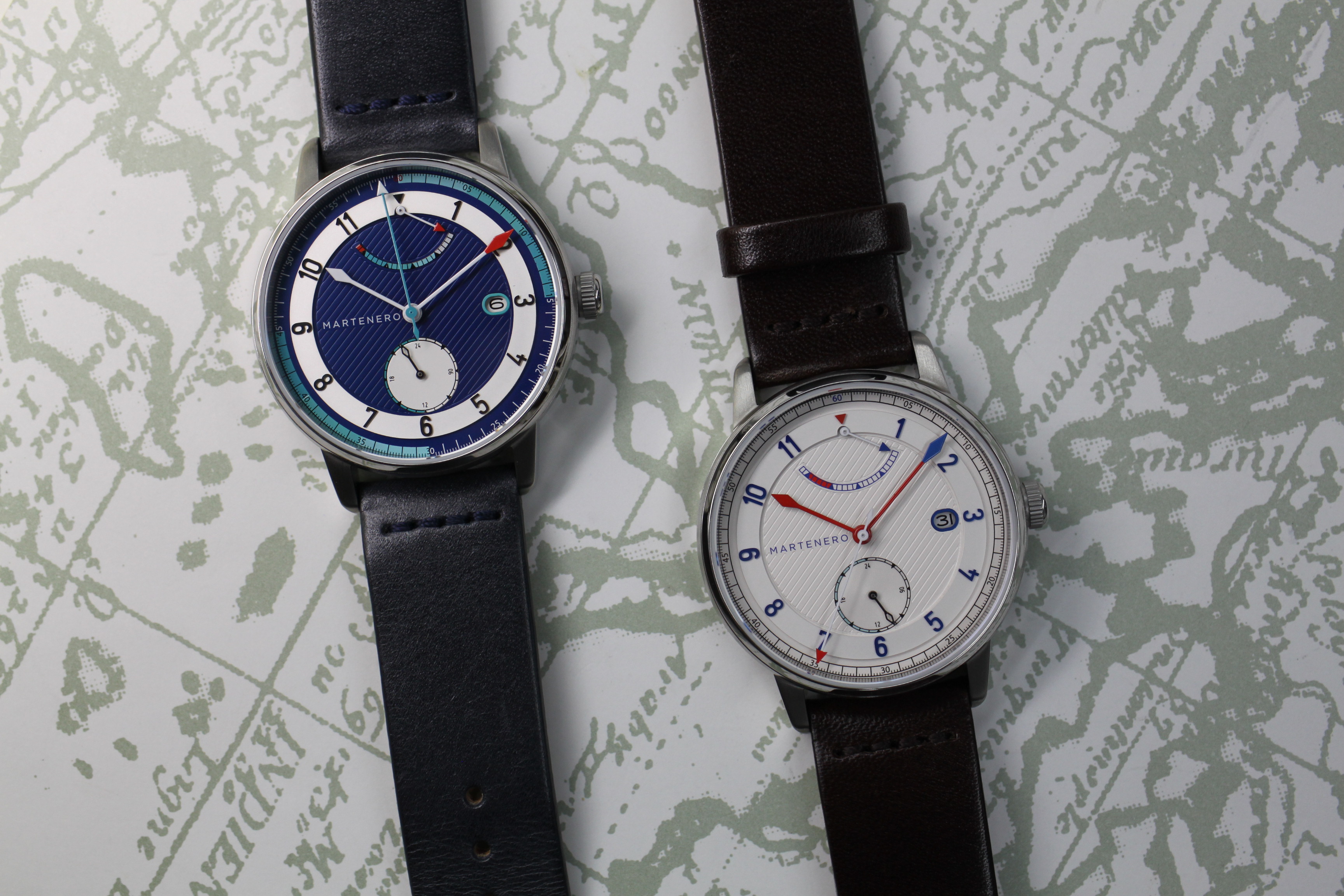
The updated Edgemere has the same nautical aplomb that its time-only sibling was lauded for. Like all previous Martenero entries, there is a number of color options to choose from. The watch I wore for around a week had a dark blue dial with red, white, and turquoise accents. Those familiar with the brand should recognize the similar hues at work throughout all five models.

Right off the bat, you can tell that the Edgemere Reserve has had a lot of thought put into not only its appearance but also its proportions. The 40-mm watch is highly legible and utilizes the same slanting lines that reach across the center of the dial as seen in its progenitor. Personally, I love these lines because they’re a simple but effective way of making the watch more memorable. Regardless of price point, it’s important to have a distinguishing identity for your product. In my opinion, these slanting lines are that for the Martenero Edgemere Reserve even more so than the identifiable color schemes.
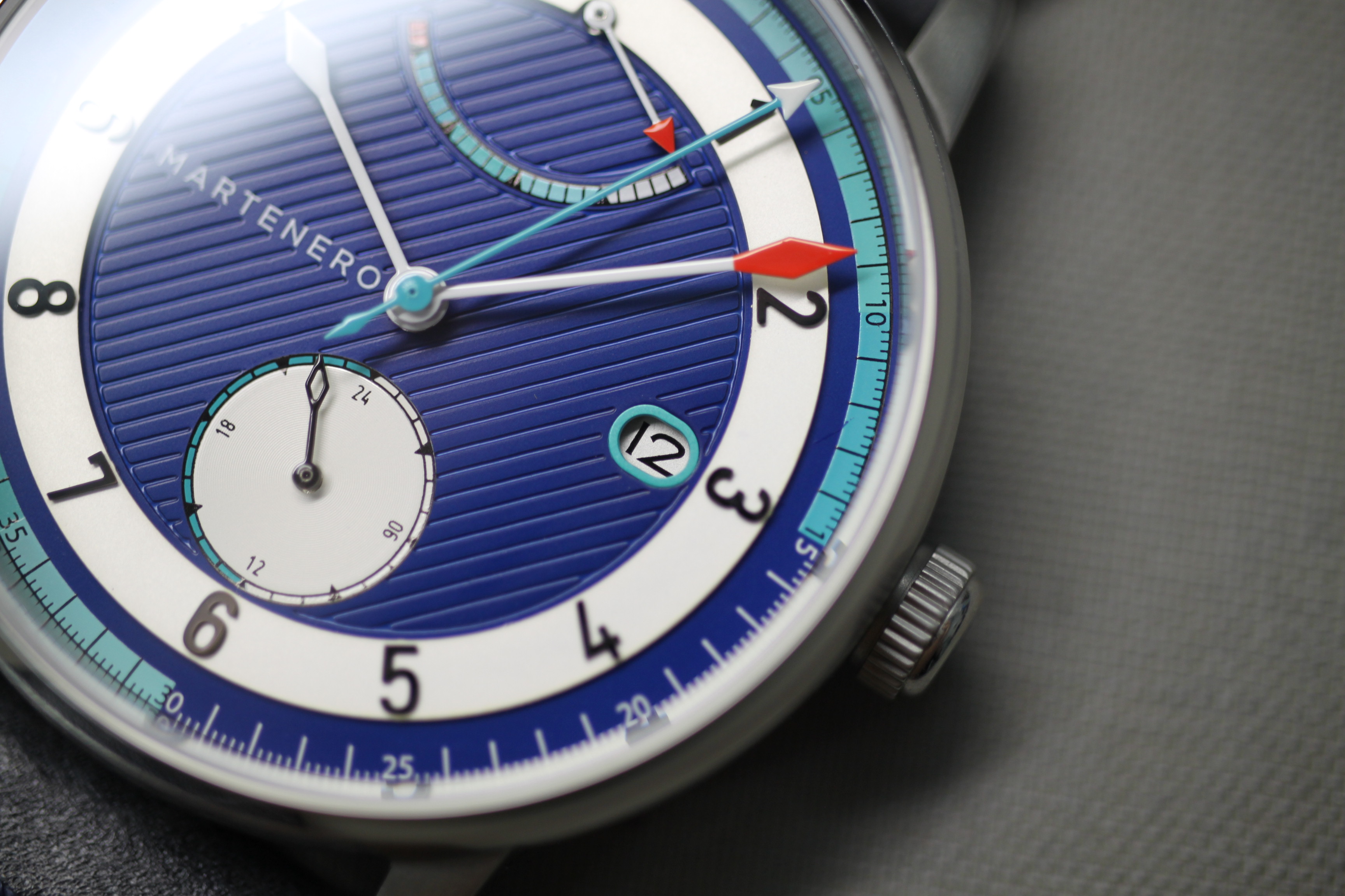
The most obvious addition to the watch is the power reserve indicator at 12 o’clock with a gradient gauge and a hand topped by a bright-red arrow. The arrowhead complements the small, red 60-seconds marker above it. Power reserve indicators are often a last minute addition to an already crowded watch face so it’s nice to see the Edgemere Reserve spotlight the underrated complication. In a way, it reminds me of how Nomos Glashütte has built out its collection over the years. Rather than focus on adding as many complications as possible, they’ve focused on building out a diverse collection of watches with Bauhaus-tinged design and thoughtful complications. Martenero’s production isn’t comparable to Nomos overall, but that same thoughtfulness can be found here.
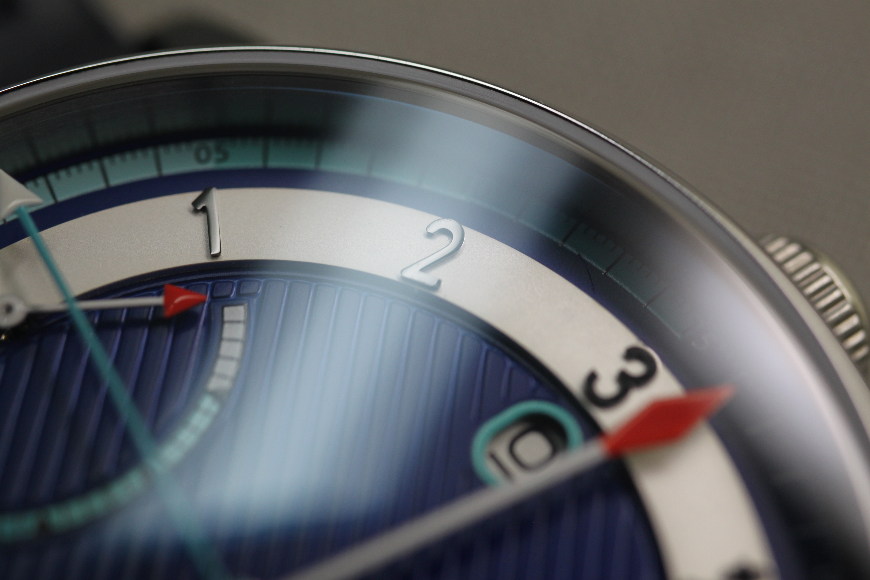
The multi-layered dial adds a lot of depth and three-dimensional appeal to the watch. The applied Arabic numerals sit tall on top of the middle border of the dial and enhance the overall legibility. The hour hand stops short of crossing over this sort of middle boundary but the minute hand glides across it. Both hands are thin and feature a spade at the end. The hour hand is entirely white and monochromatic in its approach, while the minute hand is dipped in bright red. I wasn’t quite a fan of how drastic the red was at first, but it grew on me over time and, again, worked well with the power reserve and 60-second marker. The turquoise seconds hand is long and skinny and features a minuscule white arrow tip. I really appreciate how the presence of the seconds hand is minimalized through this choice.
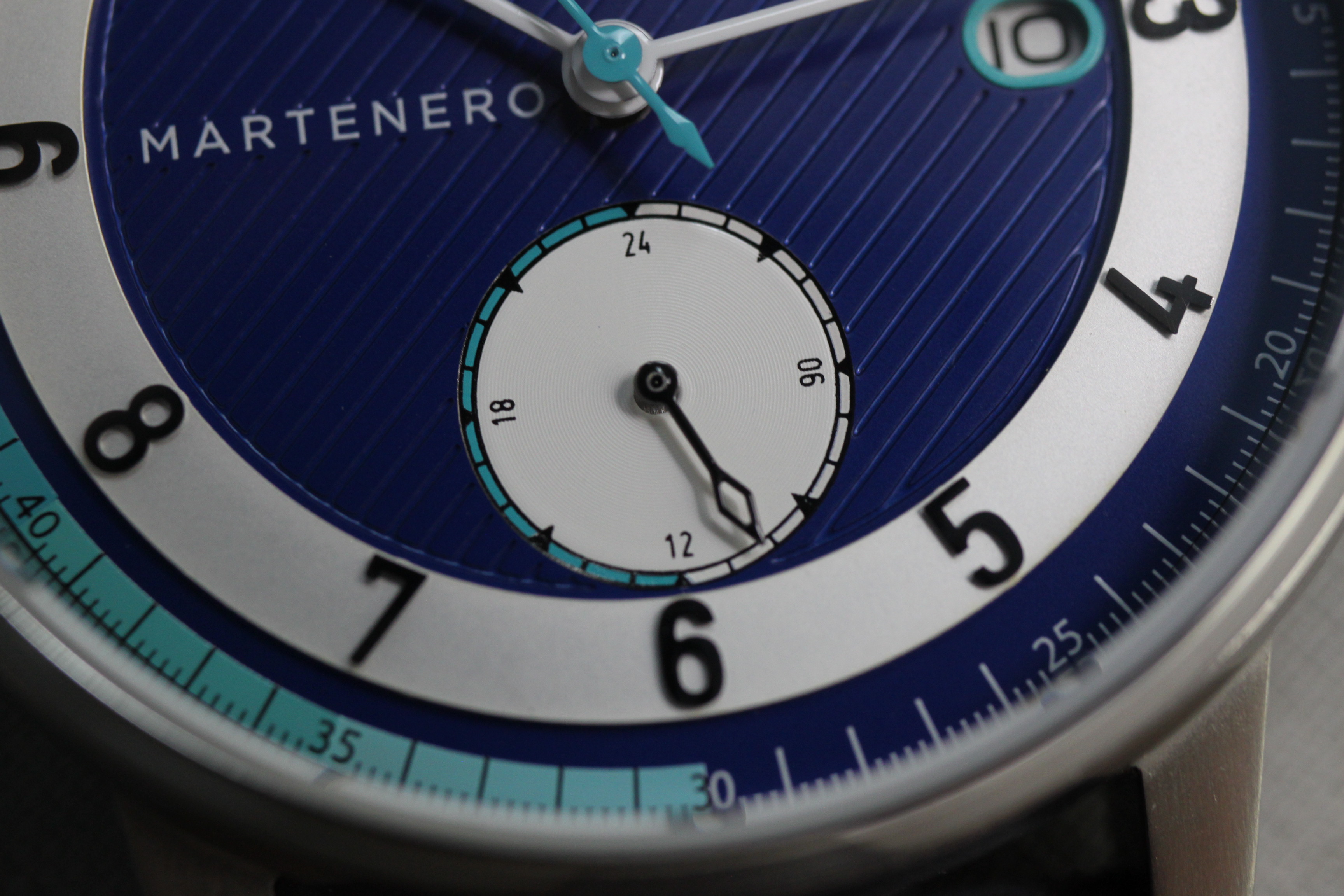
At 6 o’clock is a 24-hour subdial, which doesn’t seem like the most helpful addition at first and is mainly a consequence of the choice of movement. However, it does help with symmetry and is an upgrade to the askew sub-seconds from the time-only Edgemere. It features a soft snailed detailing and its hand is openworked. To the right of the 24-hour subdial is a date window that features an odd porthole-like border. I don’t mind the oval-ish size but the turquoise lining here doesn’t really work in my opinion. It makes the date a little crowded and somewhat hard to read, which is the opposite effect that you want from a highlighter-color perimeter.
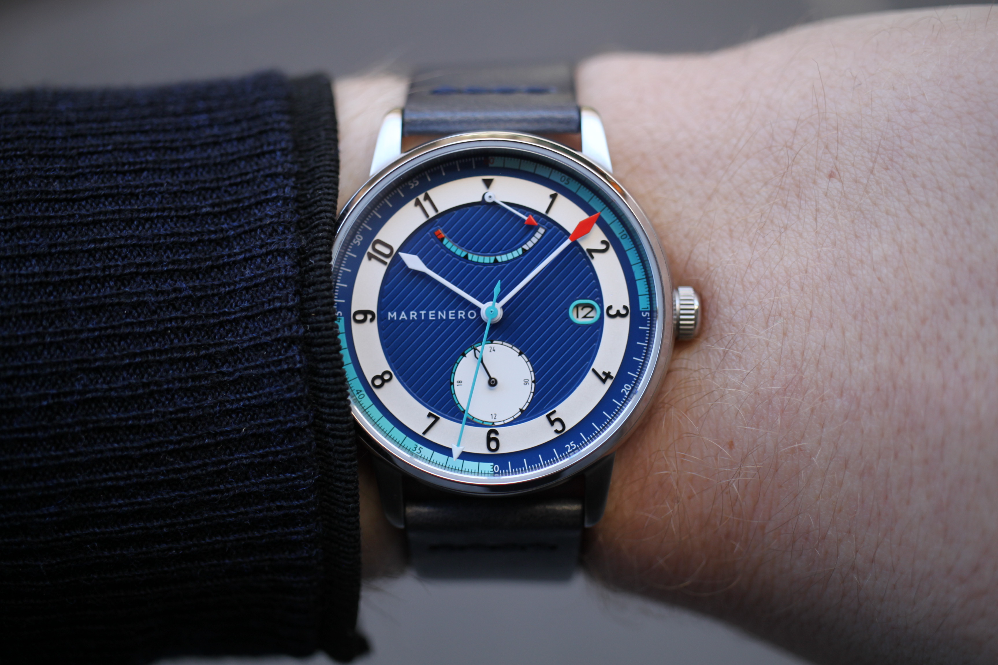
On the outside of the dial is the chapter ring with a gradient color scheme that ties the entire watch together. The transition between the turquoise and dark blue works really well and I love how the seconds markers at 15, 30, and 45 are separated into black on the turquoise section and white on the dark blue. Like I said before, it’s the small attention to detail here that helps elevate the watch.
At 9 o’clock, the Martenero branding can be found. It’s nicely spaced and doesn’t fall prey to any of the kerning disasters we’ve seen from other microbrands. Also, when compared to the branding on the first Edgemere, you can see that Tarantino made the decision to remove the “New York” text. Although I’m all for Yankee Pride, removing it makes the Edgemere less likely to be dismissed as a “fashion watch.” It’s an unfortunate side effect of both fast fashion and social media that a separation of this sort is even necessary, but leaving it off was definitely the right decision.
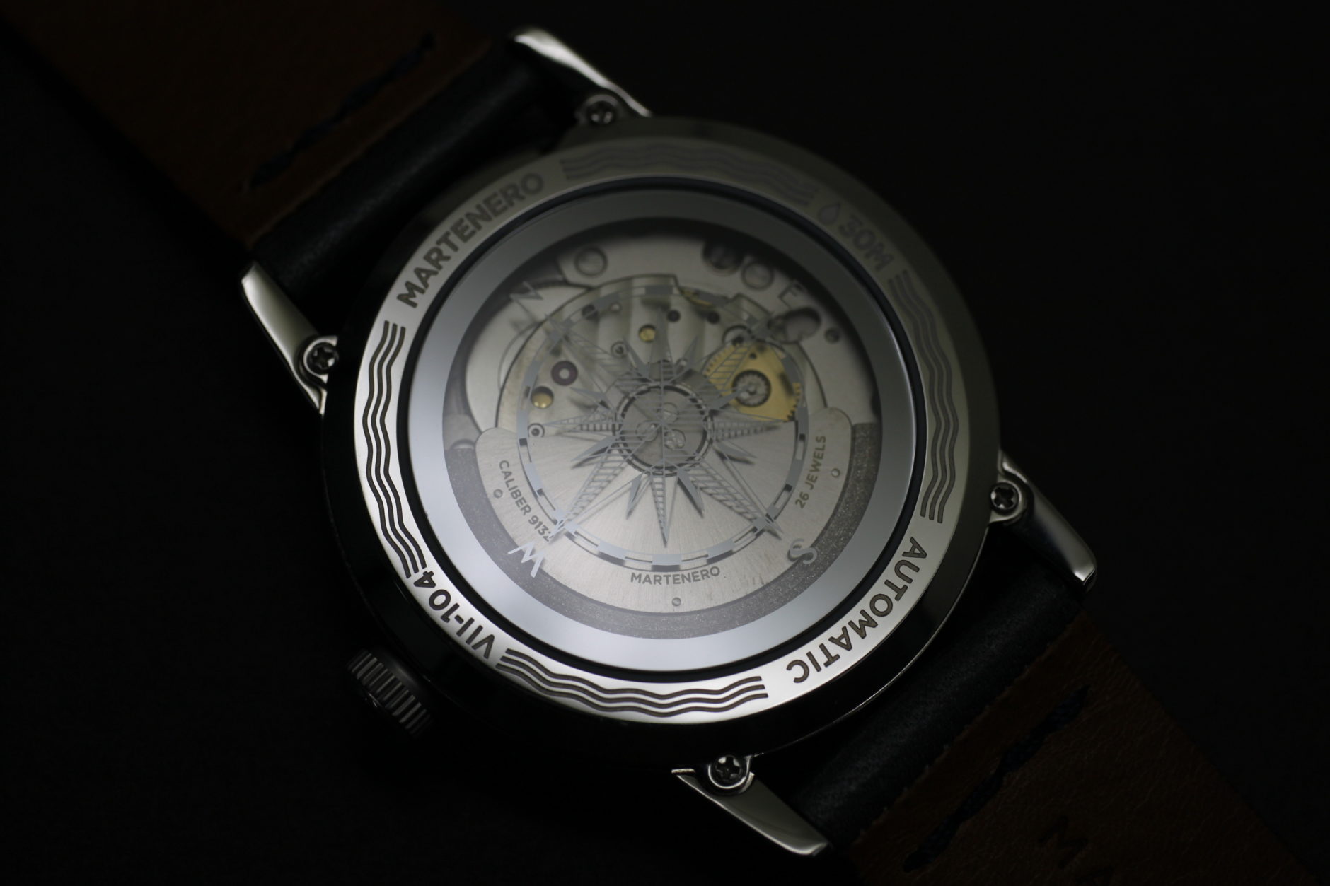
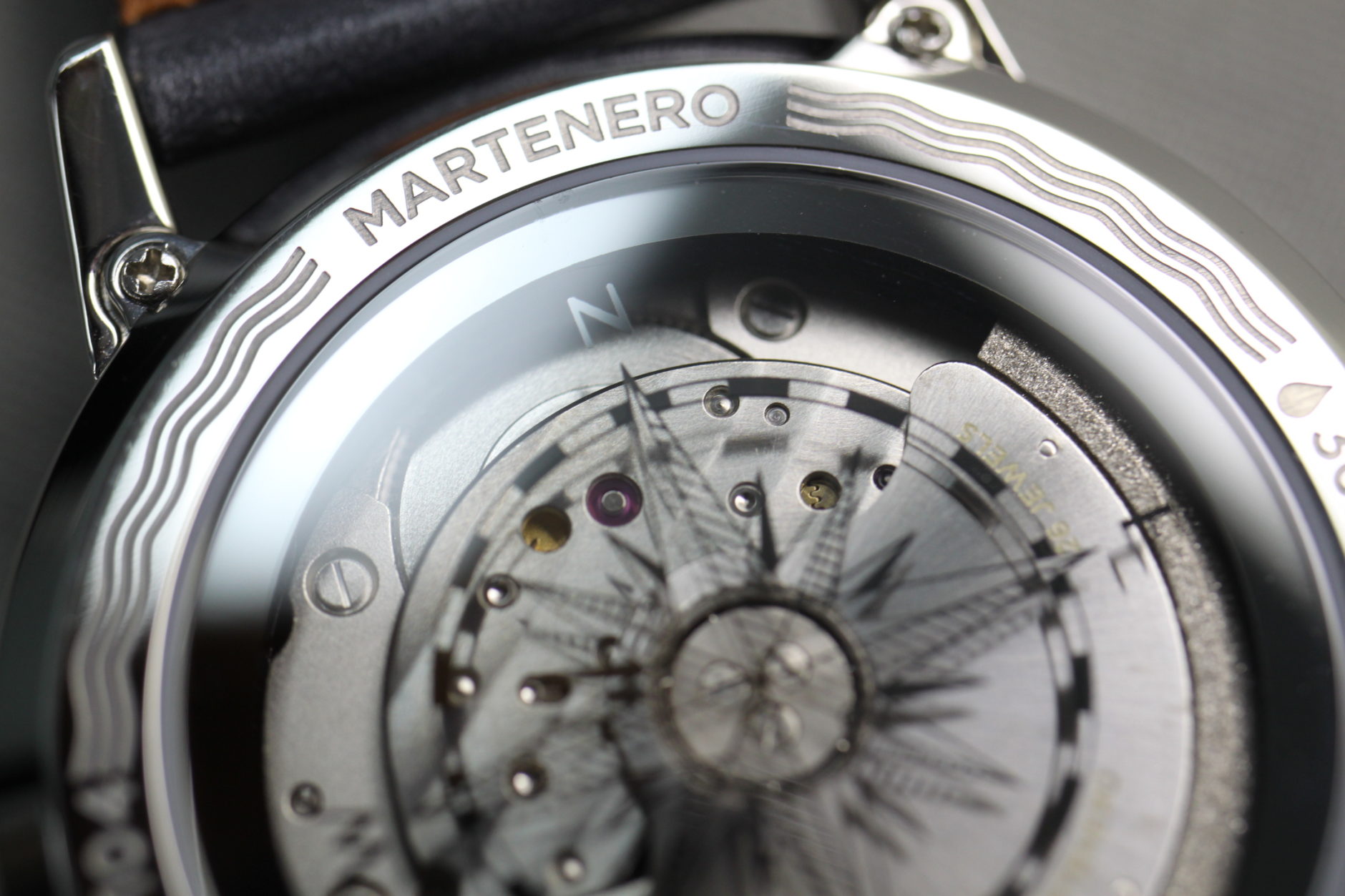
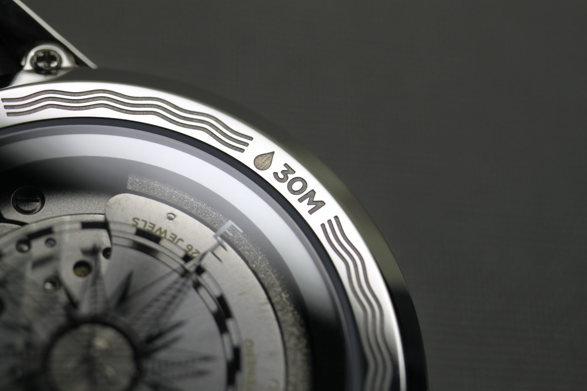
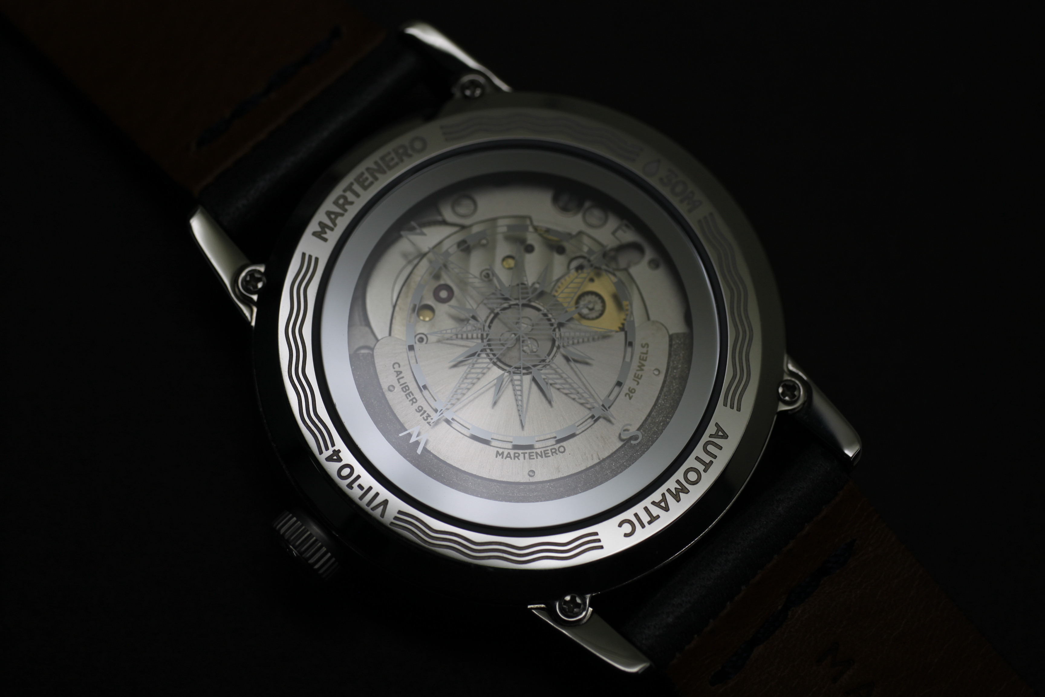
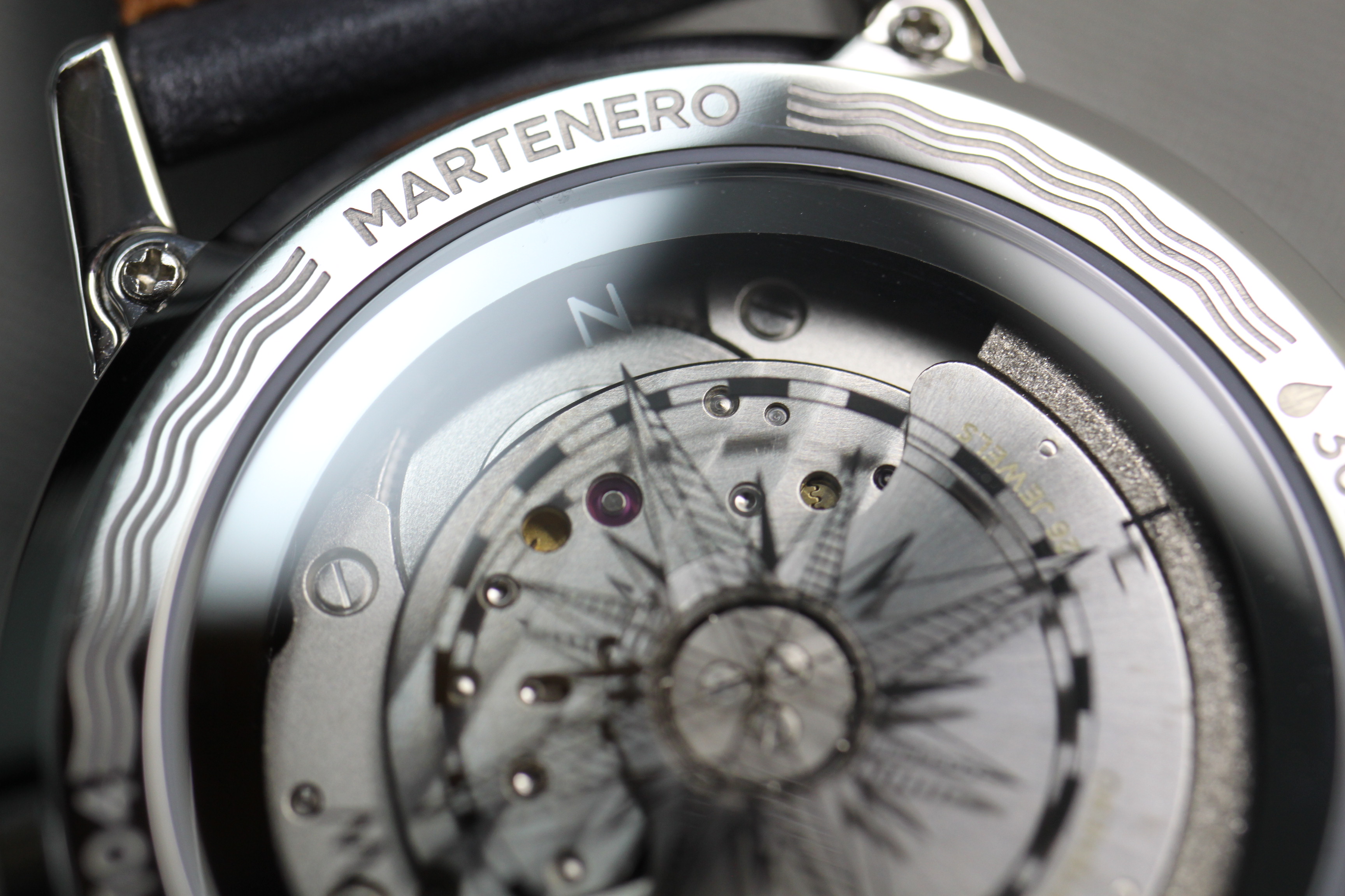
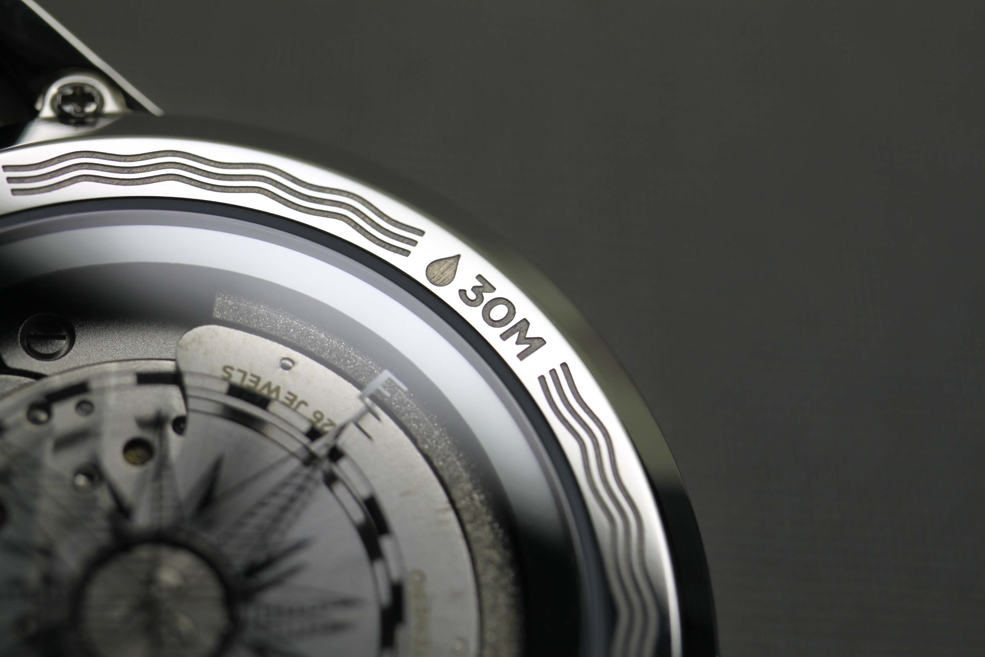
Flipping the watch over will afford you a look at the Miyota Caliber 9132 through the sapphire exhibition caseback. It’s a workhorse movement that allows for a 40-hour power reserve and hacking seconds (definitely a positive at this price point). The rotor has a grained edge and is signed by Martenero, but other than that there’s no additional decoration. Thankfully, there’s a compass design on the sapphire crystal that allows additional flair making the lack of finishing less noticeable. There’s some extra engraving around the edge of the caseback with a wave motif.
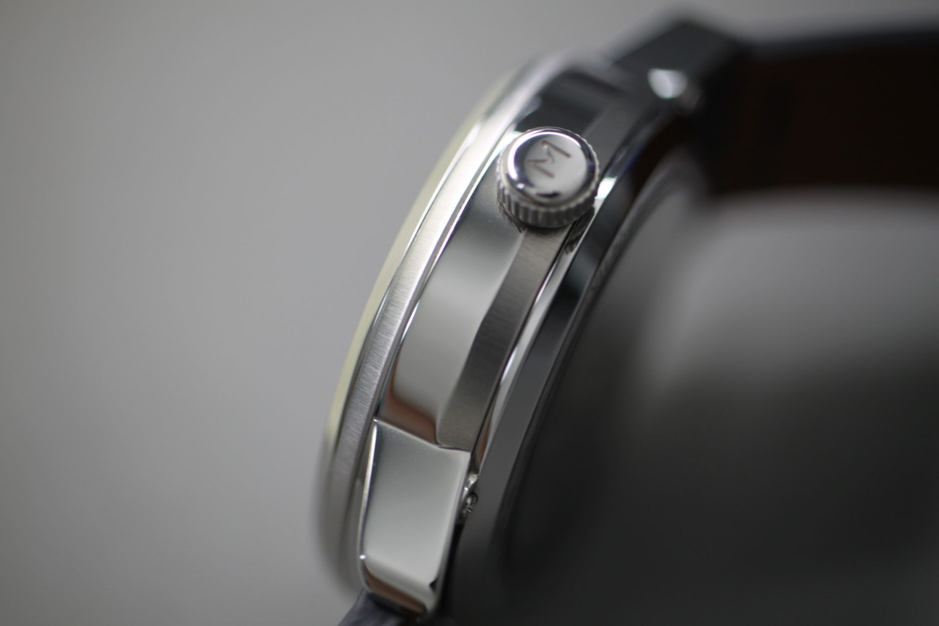
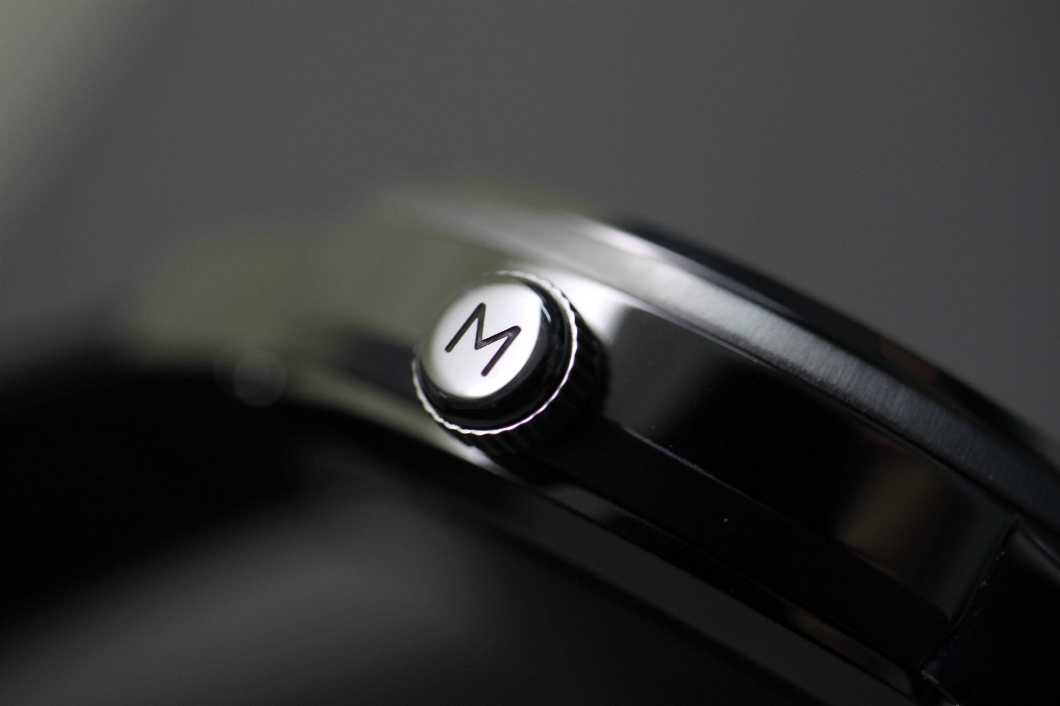
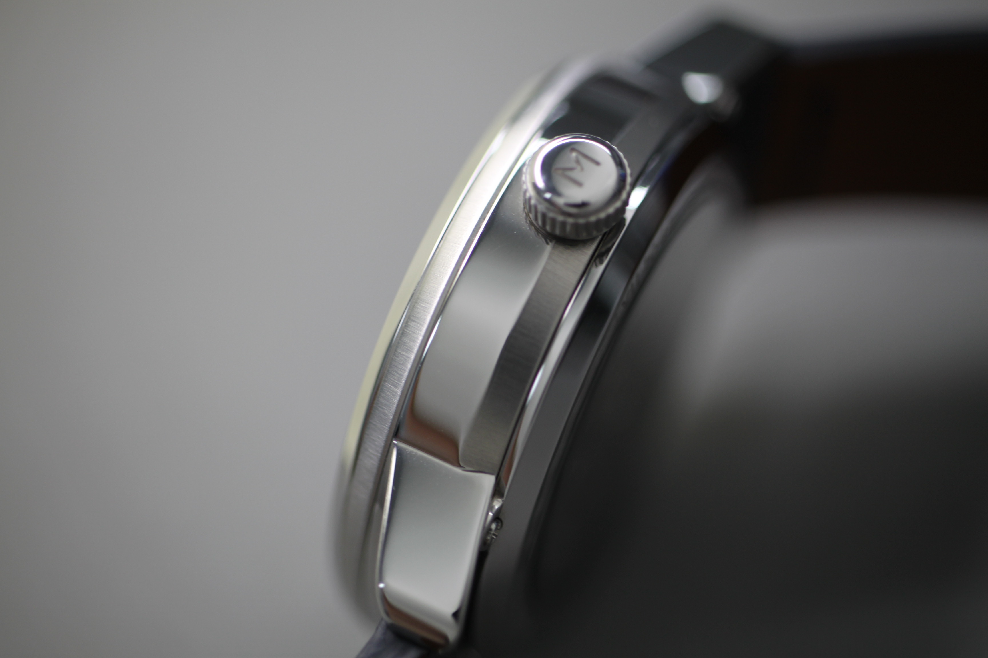
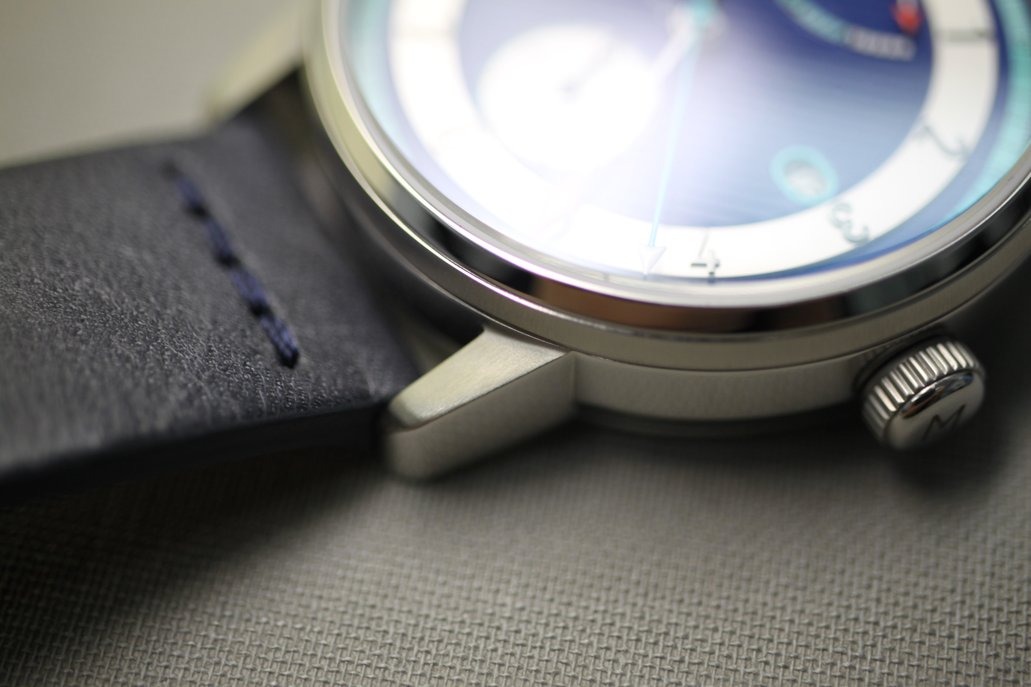
The screw-down crown helps add some assurance to the watch’s nautical theme despite only 30-meters of water resistance. That’s ok because the Edgemere Reserve is not claiming to be a dive watch in any form, rather its design is meant to recall historic marine chronometers. The crown is capped by the brand’s “M” logo.

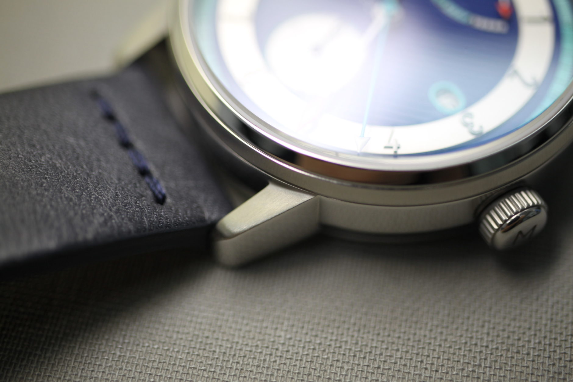
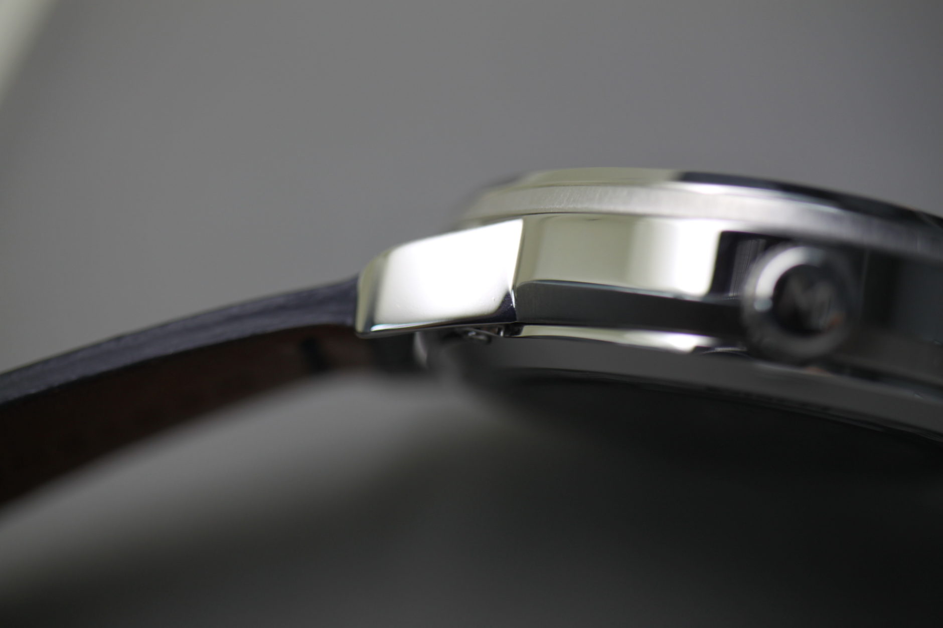
The case construction is bottom loaded with four screws that are each placed underneath the short lugs. It’s mostly polished but has brushed bevels leading to the front and back. All assembly is done in New York by a team of watchmakers that Tarantino works with. With the dominating presence of dropshipping in online retail these days, it’s reassuring to know that what you’re ordering is actually coming from where it says it is.
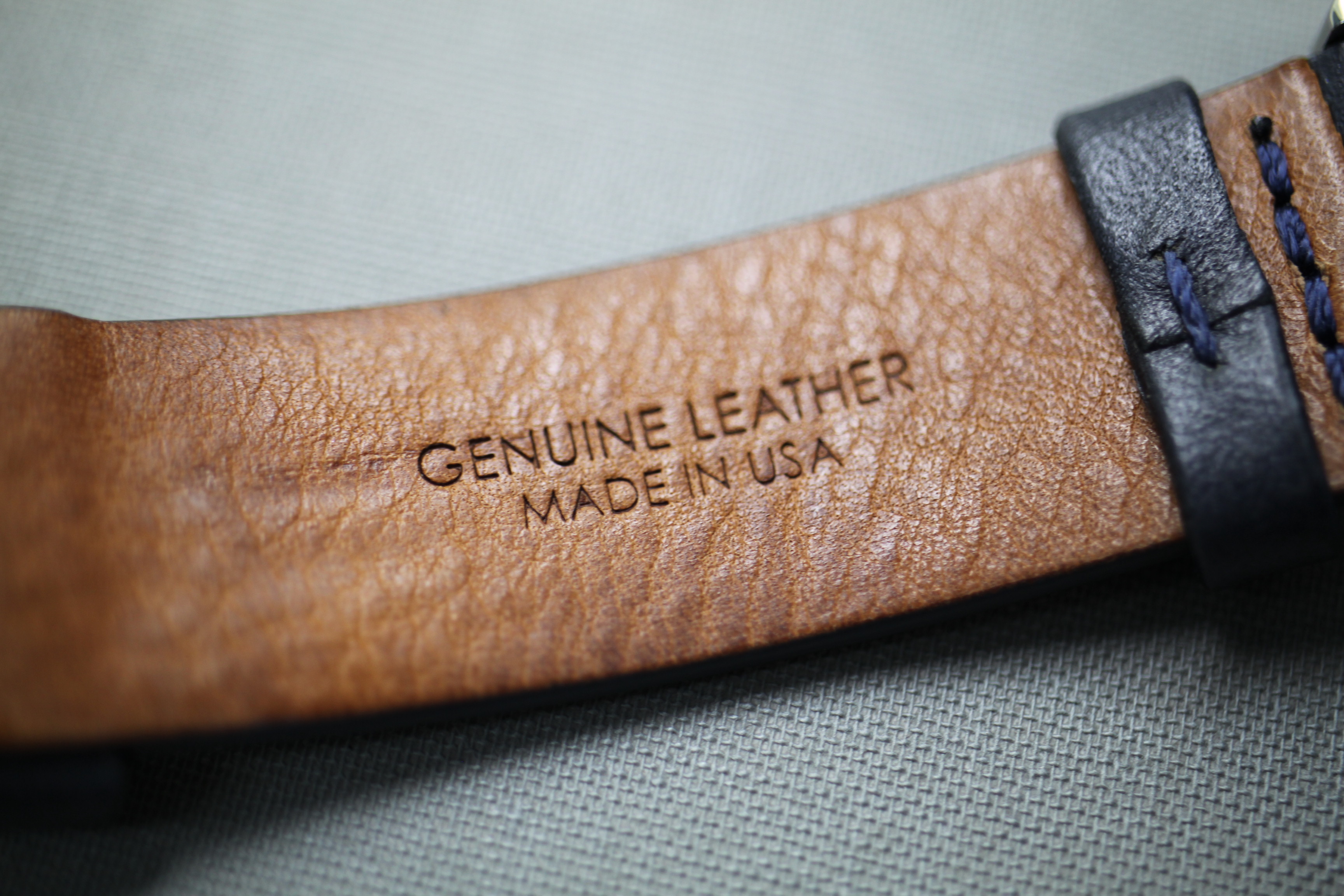
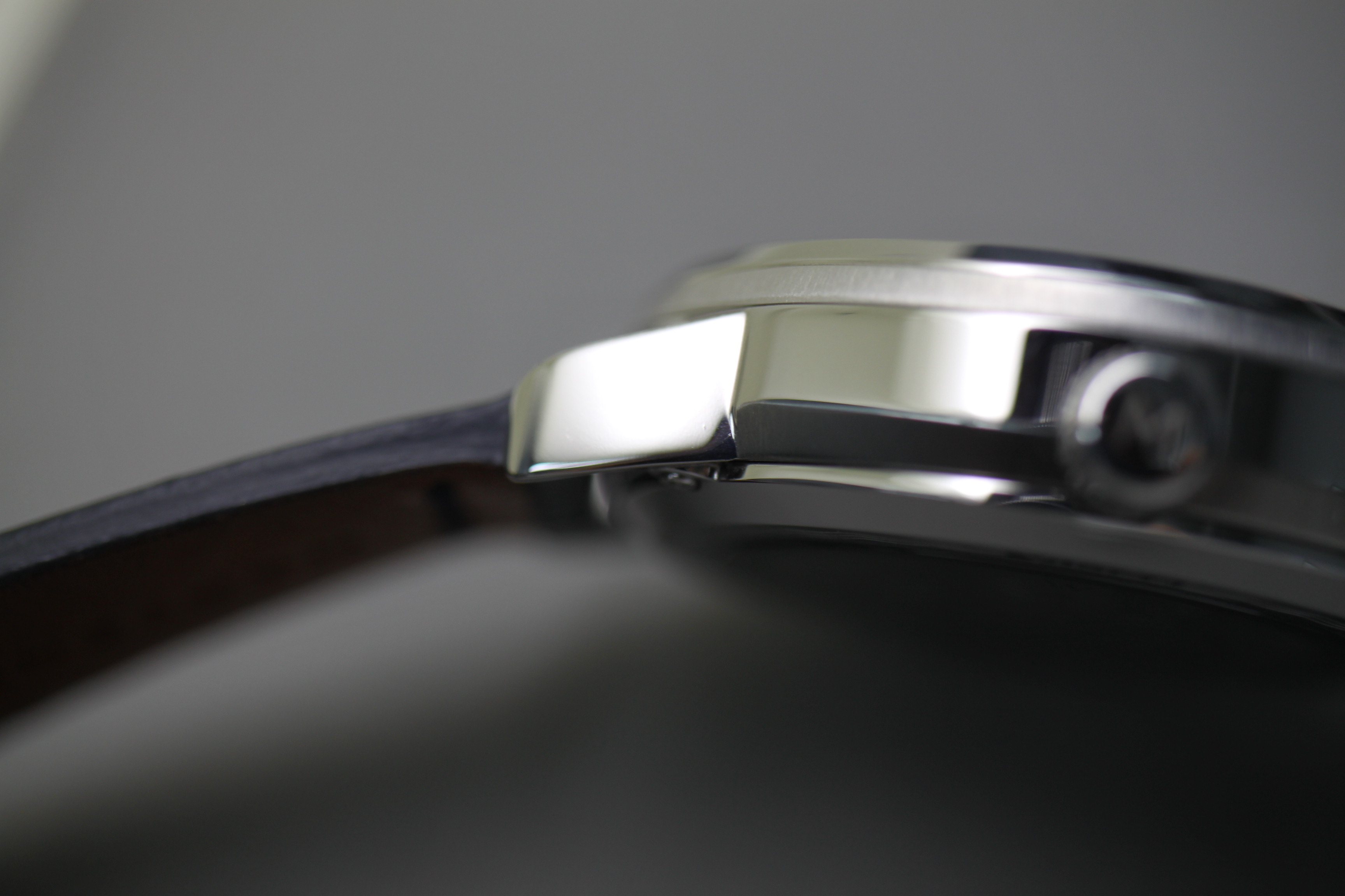
The straps that Martenero uses come from the United States and are genuine leather. They’re of surprisingly high quality and come in a variety of colors. The dark blue option I wore was both robust and comfortable and had no issue contorting to my wrist almost immediately. A polished buckle with the Martenero name seals the deal.

By the end of my time with the watch, I really only had one complaint and that was based on size. Despite having a thin wrist and commonly wearing 36-mm watches, I was left feeling like the Edgemere Reserve was almost too small regardless of its all-around sizing of 40 mm. The short and stubby lugs are almost too effective at contouring to the wrist and its overall wrist presence left me wanting more. I would love to see a second option in 42 mm similar to the dual sizing offered in Martenero’s earlier collections like the Ascent, Founder, and Marquis.


Overall, though, the Martenero Edgemere Reserve offers a sterling value proposition at only $429 in its early-bird pricing while on Kickstarter (check it out here). It’s a fantastic summer watch that is easy on the eyes and has strong technical and aesthetic considerations. Despite this being the first Martenero watch that I’ve had the pleasure of testing, the Edgemere Reserve felt like a more refined take on the previous generation and could be a great entry point for those interested in the brand. Once the funding period is over on Friday, Oct. 26, the price will go up to $695.