

 A few months ago, TAG Heuer presented a brand new in-house calibre called 1969. It was clear then that Baselworld 2014 would be the place where TAG Heuer would unveil a new watch containing that movement. And the brand did present a very nice one, the Carrera CH80, a retro-style Carrera inspired by the very first 1960s versions. What we didn’t expect, was that the CH80 presented in Basel wouldn’t actually be the final version, and that some small but significant changes were planned. For that reason, we teamed up with our friend David from Calibre 11, the famous online TAG Heuer magazine, to introduce to you the ‘real’ Carrera CH80.
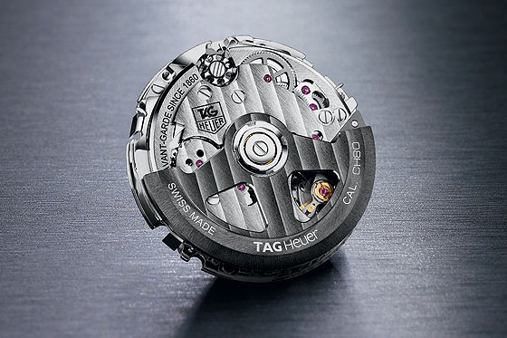
The first question that you might be asking is, why “Calibre CH80” and not “Calibre 1969?” Officially, TAG Heuer made some (minor) changes on the movement between its presentation and its official release in Baselworld. One of these was to its power reserve. Whereas “1969” was the codename for the movement in its development stage, “CH80” refers to the 80 hours of power in its final version (initially 70 hours in the “1969” stage). The other reason that we can guess for the name change has something to do with group strategy, as the CH80 will certainly be delivered to TAG Heuer’s sister brands within the LVMH Group (which also owns Chaumet, Zenith, Hublot and Bulgari) and the “1969” reference is too specific to the history of TAG Heuer. In any case, the new CH80 is a modern movement, built as an integrated chronograph with column wheel and vertical clutch, with a classical 3-6-9 subdial layout.
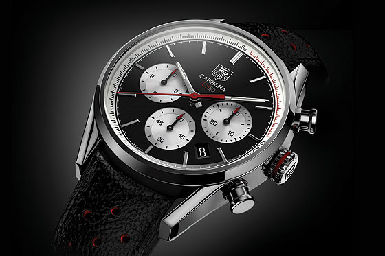
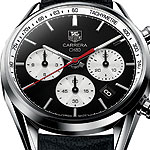
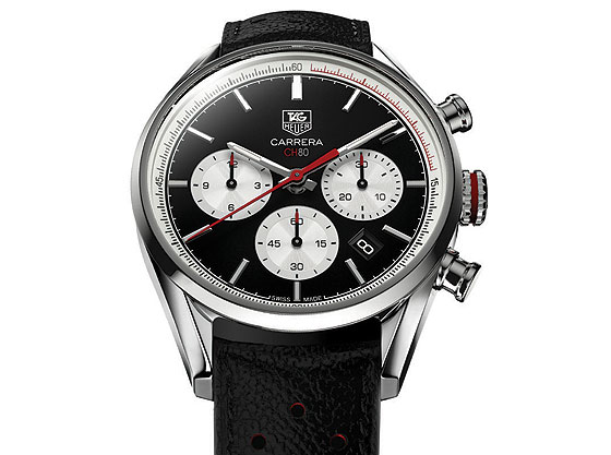
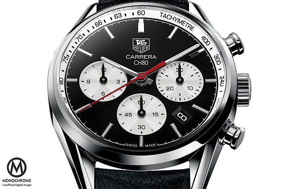
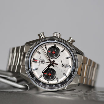
The TAG Heuer Carrera presented at Baselworld 2014 is a tribute to the old Carreras from the 1960s, and specifically the ref. 2447. The dial is offered in two versions, black with white subdials and white with black subdials – both essentially re-issues of the original’s famous “panda” dials. The Carrera CH80 also follows the trend of downsizing that we’ve noticed this year at Baselworld, as its case, with the typical Carrera design, measures a reasonable 41 mm in diameter. This “prototype” features a pulsimetric scale around the dial and various red details on the crown, subdials, hands, and logo. These details are among the most likely elements to be changed.
David, our favorite TAG Heuer insider, reported to us that based on “behind the scenes” information he’s acquired — both deductions and wishes — that several changes will be made before the new Carrera CH80 hits the shelves:
• A tachymeter scale around the dial instead of a pulsimetric scale
• No red accents on the crown, logo, and subdial hands
• A different design of the sub-dials, with a complete “azurage” and more depth
You know us at Monochrome-Watches: we love rumors (and Photoshop; check out our Baselworld predictions for Rolex, Tudor and Omega). So here is the resulting watch that our team envisioned:
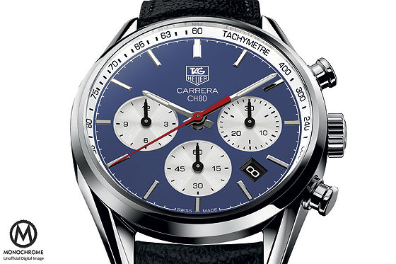
The CH80 is clearly simpler and more “mature” like this, without the red accents and with a vintage tachymeter ring, more true to the old ref. 2447. And because blue is the new black, and a major trend at Baselworld 2014 (as it was at Baselworld 2013), we’ve imagined a “Steve McQueen” blue version as well (below).
Check out more information at David’s new website, Time + Tide.
The red accents look fine – even add the 80 to the red CH. The version to be without the red accents looks too plain.
The Red accent ring on the Crown looks fine, and far better than without it.
Shorter pushers would look better and perhaps a slightly hooded Crown.
Blue may be the new black, but not the light blue shade above – it is just not Cool.
A nice dark blue….with a ‘Sun Ray’ effect. That Black dial is BLAND and needs work.
SO Is this new TAG going ahead or not.
Is this just an old article re-issued or have the new heads at TAG done a 180 and decided to go ahead and compete with Sister Zenith?
Date needs to go. Tag needs to go. Can’t remember the thickness. But hope it’s not a brick. Too much red kind of over does it for me. The blue one is horrible. What’s with the Steve McQueen, guys? Stop giving silly names to watches.
Carrera CH 80
Totally disagree with the removal of the red accents.They have it right first time, otherwise it just become’s
another boring black and white watch!! From a serious collector and Heuer admirer the only improvement
necessary is to remove the TAG from the dial, after all it’s nothing to do with watches, just the title of a holding company and an insult to one of the oldest watch manufacturers.If Edouard Heuer was alive today
he would probably be kicking Jack’s butt for dishonouring his respected name!